

|
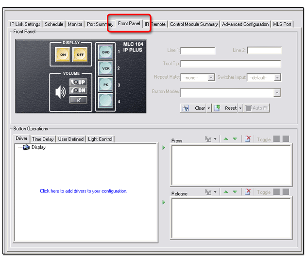
The Front Panel tab provides a graphical representation of the MLC 104 IP Plus front control panel. It gives you the ability to: |
Functions of the Front Panel tab include: |
|
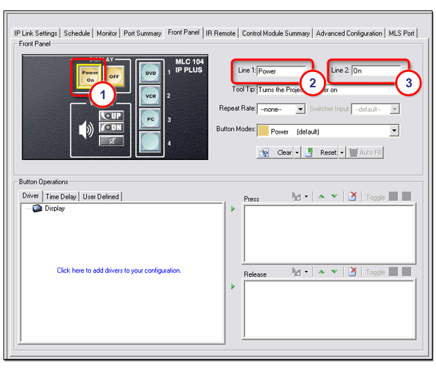
Set a button captionTo set a button caption:
In the example below, Line 1: "Power", and Line 2: "On" are displayed in line 1 (top) and line 2 (bottom) of the selected button. A caption can be set for each button in the front panel display. |
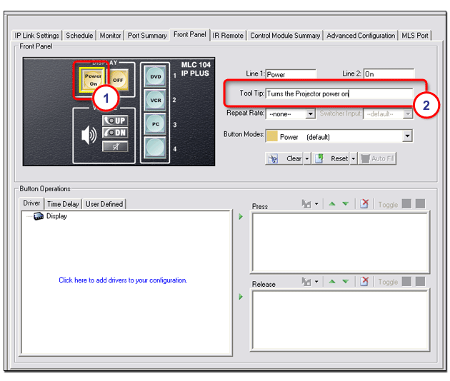
Set a button tool tipA tool tip is a descriptive line of text that is displayed in the GlobalViewer interface when the cursor is positioned over a button. To set a tool tip:
|
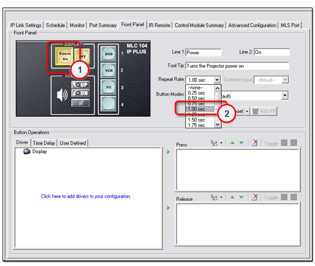
Set a button repeat rateThe repeat rate is how quickly a button repeats its function if the button is held down. ExampleIf you have configured a button as an increment volume button and given it a repeat rate of 1.00 sec, as long as you keep this button pressed (the front panel button or the GlobalViewer button), the "increment volume" command is sent every 1.00 second. To set a repeat rate:
|
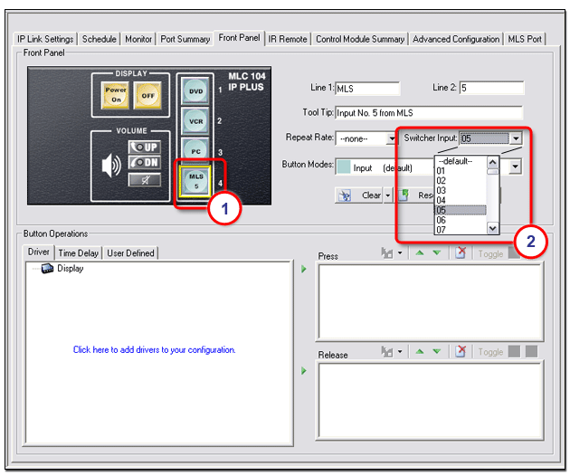
Set switcher inputThe Switcher Input field allows you to assign a specific input from an attached MediaLink Switcher (MLS) to a specific pushbutton on the MLC 104 IP Plus front panel. To assign a switcher input:
|
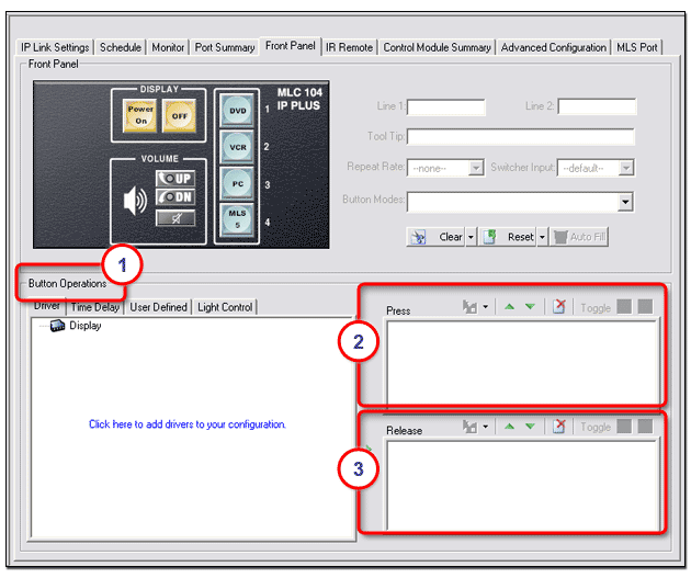
Set button operationsThe tabs located within the Button Operations section include: The functions of each tab are described in the paragraphs below. Note: Functions in the Button Operations (1) section are selected and moved to the Press (2) section or Release (3) section to be assigned to a button. If a function is moved to the Press section, the function occurs when the selected button is pressed (either on the physical front control panel of the device, or in the GlobalViewer interface). If a function is moved to the Release section, the function occurs as the button is released. Because the DISPLAY power buttons are pressed down together to enter PIN mode, it is good practice to assign functionality to them on their release (as opposed to the press) so that when you enter PIN mode, if you inadvertently press one button slightly before the other, you won't initiate its assigned function instead of entering PIN mode. Note: A red triangle in the top, left corner of a button indicates that it has been assigned a button operation. Note: Changes to the GC file do not appear in the GlobalViewer interface until the GC file has been built and uploaded to the network devices. See Build Changed Configuration for more information. |
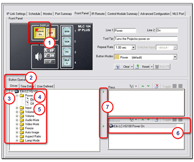
DriverTo assign a driver function to a device button:
- or - Click one of the green Right Arrows to move the selected function (On) to either the respective Press section or Release section. - or - Drag the selected function (On) and drop it over the selected button (1). |
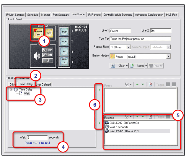
Time DelayWhen you add multiple functions to a front panel button, you may want to insert a time delay between the functions. The Time Delay tab provides the capability to add a delay of from 1 second to 180 seconds to the Press or Release action of a button. To add a time delay:
- or - Click one of the green Right Arrows to move the Wait function to the Press or Release section. |
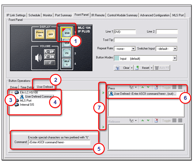
User DefinedThe
User Defined tab in the Button Operations section allows you to
add button functionality that is not For a listing of ASCII codes, open the View menu and select View ASCII Chart. To add a user-defined command:
- or - Click the respective green Right Arrow to move the user-defined command to either the Press or Release section. |
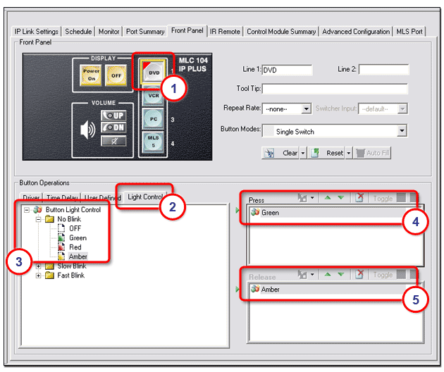
Light ControlThe Light Control tab allows you to assign an indicator color to both the Press and Release actions of selected buttons. Indicator color options are:
Indicator blink options are:
To assign an indicator color to a button:
Note: In the screen below, a solid green indicator is assigned to the button when pressed. A solid amber indicator is assigned to the button when released. These indicators appear on the actual device button and in the GlobalViewer graphical representation of the button. |
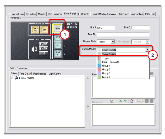
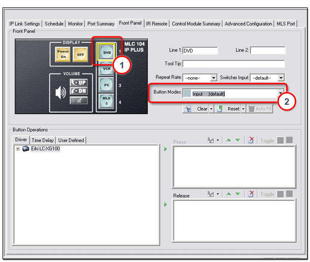
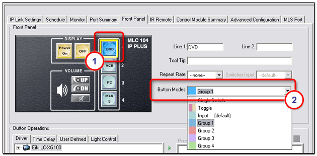
Set button modesThe options within the Button Modes drop-down list allow the you to apply three different modes of operation for all buttons on a MediaLink (MLC) device front panel. Button modes of operation are: Button modes of operation are described below. |
Single SwitchIn Single Switch mode, the pushbutton switch performs the same primary function each time it is pressed. Single Switch mode is the opposite of Toggle mode described below. |
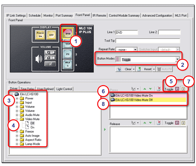
ToggleIn Toggle mode you can assign two different actions to subsequent depressions of the same pushbutton switch. If we apply the Toggle mode to a pushbutton switch, the initial press of the switch causes one action, and the next press of the switch causes a second action to occur. To create a Toggle mode button:
Toggle mode is indicated by red (top) and gold (bottom) coloring of the switch. Toggle mode is the opposite of Single Switch mode described above. |
InputAn Input button mode means that when this button is activated, the audio or video input signal associated with this button is sent to the display device. To assign Input mode to a switch:
|
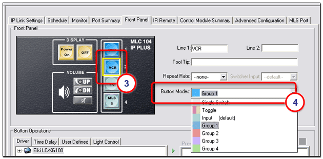
Group (X)When multiple buttons are assigned to a group:
To create a button group:
The selected button turns the color of the selected group (blue in the example below). |
The second button turns the color of the selected group indicating that these two buttons now belong to the same group. |
|
To return a grouped button to its original single switch state:
The button returns to its single switch state, and its original gray color. |
Clear, Reset, or Auto FillThe Clear button is used to clear all of the front panel button caption text. The Reset button is used to set all of the front panel button captions to their factory default text. The Auto Fill button is not active on the Front Panel tab. It is active on the Address tab when a Control Module is selected in the IP Link Tree window. See Clear, Reset, and Auto Fill for more information. |
|